Add Shading and Highlights
Use shading and highlights to add form to your coloring picture. This can make it appear more realistic, more dramatic, and not so "flat".
Light sources
Think about where the light is coming from in the picture. There may be a single light source, like the sun in an outdoor scene, or multiple light sources. The sides of objects that face towards the light should have highlights, and those that face away should have shade. Also think about where shadows will fall on the ground, walls, and other objects.
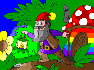
In Kilian's contest-winning entry (right), the only light source is the lantern. Kilian used excellent shading and highlighting on the gnome, flower, and surroundings.
Choosing shade and highlight colors
For simple shade and highlighting, you just use a lighter or darker version. A highlight color is lighter and shading is darker. In some cases you can just pick a suitable color from the color palette, but the best way is to use the color picker...
- Choose your base color, and color in the part of the coloring page that you are working on.
- Click on the current color (in the bottom right of the palette) to open the color picker.
- Drag the selector towards the top left to make the color lighter, or towards the bottom right to make it darker.
- Click [OK} and use the brush or magic brush with your new color to add your shading or highlighting.
To get really smooth shading you can repeat the steps with very small changes to the color each time to create a more gradual color change.
Placing shadows
Shadows should fall away from the light source. When the sun (or other light) is directly overhead the shadow falls below the object, but when it is low in the sky it cast long shadows across the ground.
Shadows bend around the objects they fall on, so that a shadow might go across the ground and then up a wall.
A shadow that touches the object shows that the object is sitting on the surface, whereas a shadow separated from the object can be used to indicate an object that is above the surface (flying, hovering, jumping, bouncing, falling).
Getting artsy
You don't have to always use the exact same hue as your base color. Experiment with using complementary or contrasting colors in highlights and shading. For example you might want to use a slightly warmer hue in a highlight or a cooler one in a shaded area.
A common technique in painting is to slightly tint a shadow with the complementary color of the object. So, for example a blue object would have a slightly orange shadow. The impressionists often used shades of purple in shadows - because purple was the complementary color to the yellow light of the sun.
Experiment!
Try out different ideas. You might be surprised what really makes a picture look great.